In my original Statement of Intent for the Product-Range-Distribution brief, I wanted to create design solutions through the use of typography and layout design to show more depth and direction towards my individual interests. Through producing a set of newspaper supplements with promotional designs for them, I thought it was a great opportunity to explore these interests and work on both my strengths and weaknesses. After having moved on from a collaborative project to a very self directed brief was obviously a complete contrast, but I took a lot from the first half of the module in terms of structure, organisation and always aiming to stay on target with the module outcomes. After writing the brief originally, I haven't had to alter it as I felt the deliverables and restrictions were realistic and achievable and I have put in a lot of effort in terms of project management to write weekly action plans and stick to them. The crits have all been useful, with relevant feedback that often allowed me to open my mind more about possibilities I hadn't always considered.
As well as my organisational skills, I feel that my contextual design research has improved greatly by constantly looking for inspiration and relevant designs that exist in today's industry and frequently blogging my findings. In previous briefs, I have always let myself down in this area by concentrating so much on researching the topic or content of my design that I looked over the opportunity to see what exciting stuff is already being designed in ways similar to my interests. This had definitely helped my design direction over the last 5 weeks and I am pleased that this realisation has come at a time where I can now continue to improve on it and turn a weakness into a strength in preparation for my third year.
In terms of wanting to exhaust all possibilities and design ideas, I feel this is definitely an area of my practice that I still am not meeting my targets in. I know I can do it, yet I continue to produce 10, 20, 30 design variations and go with my strongest idea, instead of hitting 50, 60, even 100 ideas to have a wider variety to work from. I think within the future self directed briefs I am going to be stricter with myself and set numbered targets to aim for so that I am pushing my practice to a place that would allow me to produce much higher quality design.
This brief has also made me realise just how much I want to get out of this degree and how there are so many things that I want to produce. In terms of the brief title, I was really pleased with my overall set of products and the format and layout it took on. I put a lot of effort into the fold-out element of it and tested many ways it could work. I proposed how the design would be delivered digitally and worked on the printed distribution aspect with posters and promotional designs for the newspapers. However, I think spending so much time exploring how the reader would unfold it and what layout would be a fresh and unique take on the idea of a supplement, meant that I didn't explore as deeply into the variation of typography and colour that could have been used. In my mind I covered many more typefaces and colour combinations and ruled them out without testing them which doesn't show my thought process thoroughly enough on paper, letting my development down overall.
In terms of print production and my final resolutions, I am really happy with how the content information and layout designs work together to produce a product that is relevant and realistic to its purpose. I could imagine them in the Sunday edition newspaper even though they look different to all the usual supplements found in there. Referring back to my Rationale, this was an issue that I wanted to address to 'produce designs with worthwhile content within realistic and suitable contexts'; something which I think I have achieved well.
I am now looking forward to taking what I have learnt from this module as a whole and moving forward into the third year of my practice.
[My evaluation for the Collaborative Practice can be found here]
Friday, 28 May 2010
Thursday, 27 May 2010


Wednesday, 26 May 2010
Website take 2
I wasn't happy with my original website design. It was a quick mock up that definitely needed re-visiting and I'm glad I've got the time to do so. I used one of the poster designs to act as a direct link from the Daily Mail home page, which can be seen at the top right of the page.

Instead of it taking the viewer to a homepage for the supplement, I decided to only show the next issue that will be coming out. I think this would work better so as not to show all the content of the supplements otherwise no one will be interested in getting the actual printed version as they have a full slang dictionary online to refer to.
Therefore I designed a page for each issue that will be available to click on the week before the supplement comes out in the Sunday paper:


Tuesday, 25 May 2010
Final crit feedback


After receiving the group feedback, it reiterated what I already knew I needed to polish off:
- Simplify boards - not as many photo's needed on each
- Work on website - have a link from the Daily Mail site
- Photograph 1 supplement again of simply the front & back view. Have 1 board with this net design on.
- Boards printed A2 and annotated for hand-in
- Box up products neatly for hand-in
- Evaluation on blog by 4pm on Friday
Sunday, 23 May 2010


Saturday, 22 May 2010


Friday, 21 May 2010
Promotional posters
I wanted to design a few different style posters and distribute them in areas such as in and around supermarkets, newsagents, etc. Hopefully this will entice the newspaper buyers to choose the Daily Mail because of its new, intriguing supplement. Designs placed outside would be the ones with just the phrases on to raise the level of curiosity. The ones that take on more detail and information would be found on the actual news stand to persuade. All of them are taken from the design layouts found somewhere within the fold out supplement itself.


Promotion
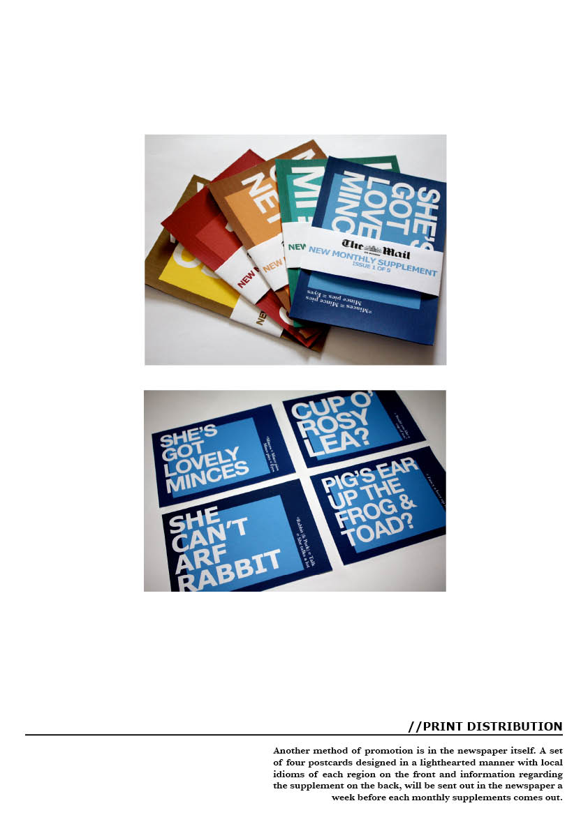
As the brief states, I have covered the Product, Range & Distribution by designing a set of supplements sent out once a month in The Mail on Sunday. When designing the layout, scale, etc I wanted to include a postcard element to it for the readers to keep or pass onto others, but decided to keep it as a simple fold out.
Therefore when it came to promoting the supplements, I thought it would be appropriate to create postcard designs to slot into the paper the week before they come out. Readers can then pass them onto others to remind them to buy the Sunday paper to get their free mini dictionary supplements.


For each supplement there is a pack of 4 postcards, each with a different idiom from the region it is promoting, with double sided designs held together by a simple sealed strip offering a list of all the titles in the set.


Promoting the Cockney:


The Geordie:


The Lancashire:


The Scouse:


The Yorkshire:


Digital
After seeing my designs taking shape for the printed side to the distribution, I wanted to spend a little time mocking up potential website designs to make my supplement work digitally. It would act as an online slang dictionary linked from the Daily Mail homepage taken from the designs on the printed supplement. The only thing that wouldn't come across online is the interactive way the reader opens the supplement, but hopefully the content is still interesting enough to exist online.
Here the type is quite difficult to read over the arrow buttons and the design is far too simple compared to the effort gone into the actual printed supplement. Therefore, I aim to put time aside in the final week to work more on this digital design to create the look that I would like.
Here the type is quite difficult to read over the arrow buttons and the design is far too simple compared to the effort gone into the actual printed supplement. Therefore, I aim to put time aside in the final week to work more on this digital design to create the look that I would like.
Thursday, 20 May 2010
Final Supplements
These have been printed out on newsprint stock to suit the context of the newspaper and because each one is folded four times, so it was the most suitable light weighted substrate to stop stiff creasing and damage. I am really pleased with how the range has turned out and I could imagine them realistically being in the Mail on Sunday.


Subscribe to:
Posts (Atom)