After looking into the 'fun package' idea to promote laughter, I have since decided to narrow down the fun pack, to the most important product in there - the laughter audio CD.
I have bought a CD with 60 minutes of pure laughter (30 different types of laughter) because after researching into laughter and finding that it is very good for your health and that listening to others laughing is very contagious, it is something that I want to promote.
The idea of bringing laughter therapy to your own home and simply taking the time out to play the CD is where I want to take this.
Tuesday, 27 October 2009
Monday, 26 October 2009
Duotone experiments


simple duotone with brown and black, similar to a sepia effect.

original photo

blue and black duotone where I have controlled the balance of both colours.

pink and blue tones

original photo

green and black duotone

same colours, different balance.
Quadtone

pink, blue, green and black.
Monday, 19 October 2009
Type Workshop - Columns
When laying out a paragraph of text, it needs to look easy to read, so having large spaces inbetween lines makes it look simpler and less writing, but if the gaps are too wide, the reader will lose interest and pause too much at the end of each line as the rhythm of the text isn't flowing. So I think my third column works the most successfully, where I changed the alignment to left alignment so it reads with a more natural rhythm and I altered the size, leading and spacing.
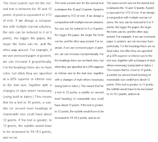
We then had the task of making the text more interesting and readable and picked our own typeface and experimented with column width. The first 3 column width (at original A4 size) has good readibility, rhythm and size (11 point). However, to improve it, I learned that I shouldn't have used a sans serif typeface (Helvetica) because a serif typeface is easier to read. This is due to the majority of our English letters being shaped vertically, e.g. l,t,m,n,p,d etc. so a serif style is what helps the reader move along the lines of text horizontally.
For the two column width - second column in from the left - I used a smaller point size than the 3 column because it means you can fit more words on a line and with the minimum words on a line being 6, any bigger and there would only be a few words on each line and your eyes would be jumping around trying to read it.
 No matter what you do with a 1 column width, unless it's only a very short paragraph of text, it doesn't work as well as the other two. You either need to shrink the text size to being almost unreadable to fit more words on a line, or be able to read it at a bigger size and have no flow to the text.
The final 6 column width paragraph of text is currently set at 12 point in size but it actually doesn't need to be that big. As an article, it only needs to be big enough to read it right in front of you, so 11 point would be better. Then, as a designer, you have more space to play around with. Finding the subtle balance between size and space is what matters. From an editorial point of view, however, there is a maximum 12 words to a line (around 60 characters) to keep you interested and make it comfortable to read. Any more than that and you have to move your head to read along it and risk losing where you are when you go back to the left for the next line. To avoid this, you can either use a more condensed typeface, or shorten the column width to 2 or 3 like the ones above.
Type Workshop - Hierarchy
This was an experiment in ordering information so that it was typed out Four, three, two, one - but it read One, two, three, four. The first plays around with size, the second with the layout and size.


Below is a similar example, but with more words it starts to become more difficult. I tried to experiment with layout but I don't think the hierarchy is successful on this one because many people said they read it as "All things good.." or the 'things' was missed out altogether and it read "All good come to those..." This is due to where the eye falls and, as readers, we are lazy and our eyes drop down the page, so it's hard to make the eye jump back up to 'things' once it's dropped down to 'good'.

This response below works a lot better because it's creating a simple path that our eyes can follow. The 'things' should now come after the 'good' more naturally and I think it is close enough and on level with 'good' to not miss it out completely. Size and layout clearly affect the hierarchy in the way we read the information, but so can font, upper and lower case, and weight of a letter.

Type Workshop - Kerning
I thought it was an interesting task when we played around and understood more about kerning, because some letters automatically don't sit right next to others, so it was up to us to try and change it for the better. Lower case letters don't look as bad, and my name below has hardly been altered. I just brought the 'y' closer and separated the 'f's' so that they all sat at a similar distance to each other.

However, upper case letters cause more problems and the gaps look more uneven and obvious. Some pairs don't fit next to each other well, such as the L and A below.

original
kerned version

However, upper case letters cause more problems and the gaps look more uneven and obvious. Some pairs don't fit next to each other well, such as the L and A below.

original
kerned version
Thursday, 15 October 2009
What is Good? - Part 2
Concept statement
After researching into the idea of laughter being good for you, I am now going to produce a graphic response that:
Packages & Promotes or
Packages & Persuades or
Packages & Informs or
Packages & Instructs
my 'What is Good'.
I narrowed the subject of laughter down to a concept statement that I am going to work with:
Laughter is good for your health.
Initial ideas
Because laughter is good for your body and mind, I want to produce packaging for a product that encourages people to take time out of their day to laugh and pass it on. I could possibly:
- Promote a fun package to make you laugh and then pass it on (to promote the contagious aspect of my concept statement)
- Persuade people to go to humour therapy classes/bring the classes to your own home
- Inform people why it is so good for your health
But before I make any decisions, I want to research into existing packaging that interests me and that could be relevant for my response. This can be found on my Design Context blog.
Things to think about:
- Who is my target audience?
- What packaging is relevant in terms of the message I want to get across?
- What colours and print processes are relevant?


Sunday, 11 October 2009
What is Good? - Part 1
For the research side to this brief, see my Design Context blog.
Below, however, is selected research that I put into a presentation.
My chosen 'good' is laughter:


Below, however, is selected research that I put into a presentation.
My chosen 'good' is laughter:


Thursday, 1 October 2009


Summer Postcards - Full colour
The idea of this brief was to use our summer taxonomy work to produce a set of four postcards; a full colour image, 3 colour, 2 colour and a 1 colour pictogram. So the next set of posts show my design sheets and final resolutions for this.


Subscribe to:
Posts (Atom)