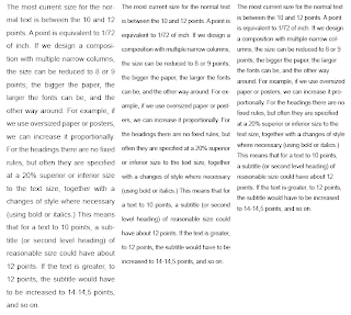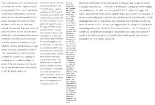
We then had the task of making the text more interesting and readable and picked our own typeface and experimented with column width. The first 3 column width (at original A4 size) has good readibility, rhythm and size (11 point). However, to improve it, I learned that I shouldn't have used a sans serif typeface (Helvetica) because a serif typeface is easier to read. This is due to the majority of our English letters being shaped vertically, e.g. l,t,m,n,p,d etc. so a serif style is what helps the reader move along the lines of text horizontally.
For the two column width - second column in from the left - I used a smaller point size than the 3 column because it means you can fit more words on a line and with the minimum words on a line being 6, any bigger and there would only be a few words on each line and your eyes would be jumping around trying to read it.
 No matter what you do with a 1 column width, unless it's only a very short paragraph of text, it doesn't work as well as the other two. You either need to shrink the text size to being almost unreadable to fit more words on a line, or be able to read it at a bigger size and have no flow to the text.
The final 6 column width paragraph of text is currently set at 12 point in size but it actually doesn't need to be that big. As an article, it only needs to be big enough to read it right in front of you, so 11 point would be better. Then, as a designer, you have more space to play around with. Finding the subtle balance between size and space is what matters. From an editorial point of view, however, there is a maximum 12 words to a line (around 60 characters) to keep you interested and make it comfortable to read. Any more than that and you have to move your head to read along it and risk losing where you are when you go back to the left for the next line. To avoid this, you can either use a more condensed typeface, or shorten the column width to 2 or 3 like the ones above.
No comments:
Post a Comment