Thursday 28 January 2010

Type workshop 3

Anti BNP flyer design:

1. Before print


2. Slight adjustments after seeing the printed A5 version, with logos added


Tip:
Demonstrating how to group the logos together to make them all have an equal hierarchy against one another so that I can begin to look at them and use them as one image, instead of them causing problems individually. I can then resize them as a group when adding them to documents, such as the flyer above, to keep them all in proportion.


3. After adjusting the logos to equal proportions:


Wednesday 27 January 2010

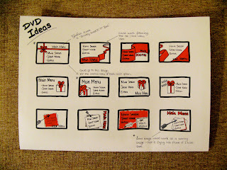
DVD Menu Designs


Click on the image to view larger and read my design decisions.

Tuesday 26 January 2010

Type Chosen, but what colours...

I haven't decided which is going to work best yet... but I am either going to choose just one of these colours below and use it throughout the ident or involve all these colours below, so whenever a film is being promoted, the colour relevant to that film will be the colour of the text... I think I will take it to after effects and test both versions.


Considering type..

I have been experimenting with what typefaces to use on my idents by looking at the ones used on opening title sequences of my chosen films (see my design context blog). However, I think instead of my initial idea, which was to use the relevant typefaces for each film meaning there would be upto 7 different typefaces throughout one ident, I am going to choose just one that I think sums up the romantic comedy theme and use the same one throughout. This will link in each frame better, make it look less jumbled and will be another common element that will link all 5 idents together as a set.

With this being said, I considered a few various typefaces to see which one was the most suitable and asked people within my target audience sector which grabbed them the most.


Bradley Hand ITC TT Bold


Perpetua Titling MT


Helvetica bold


This handwritten style typeface, Bradley Hand ITC TT Bold, was used in the Bridget Jones Diary title sequence and proved to be the most popular one to use throughout my idents. I am happy with this decision because I am not actually including the Bridget Jones films in the rom-com season promotion, so it's a neutral one to have chosen and seems to suit all chosen film titles effectively.

Thursday 21 January 2010

Type workshop 2 part 2

This second half to the session was really interesting, as we were given a brief to design a 60mm x 30mm press advert for Dan Broughton (a fictional character). My first attempt was portrait, which made it difficult to layout the text, but I thought I managed it quite effectively and still had a good amount of space so that it didn't look overcrowded with information. However, as the dimensions were so small, at the actual size it would have been printed, the writing was unreadable and the logo design of his name took up too much room.


For the second attempt we were allowed to create it as a landscape version and had to really think about the hierarchy of the text. This meant working out which information was the most important, so needed to be seen first, and which was not as vital, so should be smaller, if written on at all.


This version was my favourite out of the two, as by simply moving his name over to the top left meant that the other information didn't sit in a long list on the right, but by keeping the 'Decoration & Design' larger, bolder and underlined meant that it was still seen first even if it wasn't at the top of the ad anymore. This layout also seemed to allow me a bit more space to play around with.

The decision to remove the rest of the information, such as

Friendly, prompt services
High quality workmanship
Competitive rates

was one that I thought clever, because they are not factual statements, but the opinion of the designer himself. He might think he is friendly and has a high quality service, but we might not. Therefore it doesn't need to be included, especially if it were in a yellow pages advert, where mainly only the service, name and number are important.

The typeface (even though the viewer is not a knowledgeable typographer) should speak for itself and show that it is a professional, sophisticated but friendly and quality advert.

This design below was chosen in the session to take the award of the advert that best fit what the viewer would be looking for.

:-)

Type workshop 2

Our first task of the session was to use the typeface we had chosen for our characteristics poster and describe its physical appearance in 3 words, think of what it would be if it were an animal, and a job title.


Group crit feedback


Saturday 16 January 2010

Type Task 1:

Was to choose a typeface and describe its characteristics in a similar way to the ones we were doing in the first workshop.

Thursday 14 January 2010

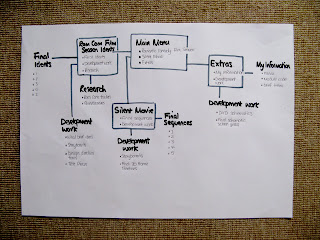
Schematic for DVD

5x 6 frame storyboards

I actually think my rough storyboard sheets are clearer to see what my idents will look like as I found it difficult to narrow down the frames to just 6 per ident. They do not flow as well or show the typefaces I want to take into After Effects as I am still debating which ones to use. However, here they are so far:


Initial storyboard ideas


Basic Action Plan

- Create 6 frame storyboards
- Design schematic
- Update blog (digitalise design sheets and storyboards)
- Continue researching
- Start experimenting with After Effects to see if storyboard ideas will potentially work.

Design Direction

Type workshop 1

This first session was an introduction to typography and its characteristics. We had to describe a typeface by choosing an example of an uppercase and lowercase as shown below. We then became comfortable with how the program Quark Express worked and played around with our letters creating patterns by multiplying and rotating it.


Tuesday 12 January 2010

Sunday 3 January 2010