I know I have already posted these to my blog but I have put into this one blog post most of
what I have been working on since the last feedback session to make it easier to present in this final crit.Storyboards
1.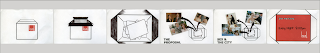
2.
3
4.
5.
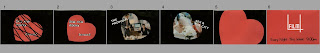
Testers:
Experimenting with basic 3D layers and rotation to create the opening frames of my first ident:
2nd tester: Adding the 10 second music clip I want to use, taken from Love Actually's soundtrack titled Portuguese Love Theme. The gentle build up and soft notes are exactly what I was wanting to run behind all 5 idents to link them together. There's no movement after 2 seconds, but I was experimenting matching the opening frames with the timing of the music ...
1st Final
First of my five 10 second idents completed:
2nd Ident tester
(Ribbons will appear like the text floating from frame to frame linking one film to the next - see storyboards)
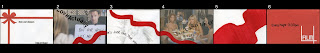
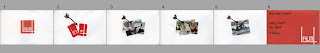
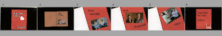
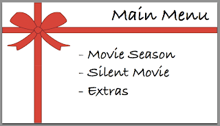
DVD Designs:
Here are the final designs for my dvd. There are 3 designs; the first being the main menu, the second is an internal menu linking from that and the third is the next step to reach my videos/development work etc.


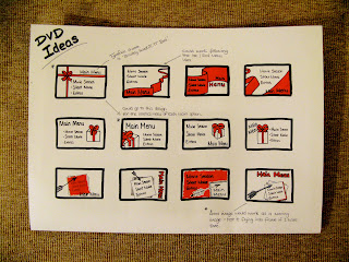
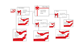
Original schematic layout but with these 3 chosen designs (I know its small but you get the idea of how the designs fit in). Next step... put them all together in DVD Studio Pro.
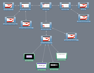
Experimenting putting my designs above onto DVD Studio Pro:
1 Week Plan:
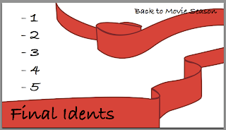
- Learn how to make the ribbons in ident2 follow a path so it flows like the text does.
- Complete other 3 idents
- Put all my work together onto DVD Studio Pro
Questions:
1. Does the combination of designs work well in the dvd interface, or would it look better to just have the same menu background throughout?
2. The typeface used in all idents and in the dvd designs was chosen from the Sex and the City opening title sequence (suggested in my previous crit). Do you think it looks relevant to the Romantic Comedy theme as a whole?
3. Is the ten second music clip in my first ident appropriate or does it need lyrics?
4. Should I alter the film four logo more evidently to fit in with the rom-com season? (such as use the ribbons on ident 2 to flow into the logo shape perhaps...)
5. Is the first completed ident too rushed? Have I included too much into the 10 seconds? If so, how could I simplify it?
*Reasons for typefaces and colours chosen can be found on these two blog posts:
Type
Colour
***End of Presentation***
2.
3
4.
5.
Testers:
Experimenting with basic 3D layers and rotation to create the opening frames of my first ident:
2nd tester: Adding the 10 second music clip I want to use, taken from Love Actually's soundtrack titled Portuguese Love Theme. The gentle build up and soft notes are exactly what I was wanting to run behind all 5 idents to link them together. There's no movement after 2 seconds, but I was experimenting matching the opening frames with the timing of the music ...
1st Final
First of my five 10 second idents completed:
2nd Ident tester
(Ribbons will appear like the text floating from frame to frame linking one film to the next - see storyboards)
DVD Designs:

Here are the final designs for my dvd. There are 3 designs; the first being the main menu, the second is an internal menu linking from that and the third is the next step to reach my videos/development work etc.


Original schematic layout but with these 3 chosen designs (I know its small but you get the idea of how the designs fit in). Next step... put them all together in DVD Studio Pro.

Experimenting putting my designs above onto DVD Studio Pro:
1 Week Plan:
- Learn how to make the ribbons in ident2 follow a path so it flows like the text does.
- Complete other 3 idents
- Put all my work together onto DVD Studio Pro
Questions:
1. Does the combination of designs work well in the dvd interface, or would it look better to just have the same menu background throughout?
2. The typeface used in all idents and in the dvd designs was chosen from the Sex and the City opening title sequence (suggested in my previous crit). Do you think it looks relevant to the Romantic Comedy theme as a whole?
3. Is the ten second music clip in my first ident appropriate or does it need lyrics?
4. Should I alter the film four logo more evidently to fit in with the rom-com season? (such as use the ribbons on ident 2 to flow into the logo shape perhaps...)
5. Is the first completed ident too rushed? Have I included too much into the 10 seconds? If so, how could I simplify it?
*Reasons for typefaces and colours chosen can be found on these two blog posts:
Type
Colour
***End of Presentation***
No comments:
Post a Comment