Columns:
More white space from a margin doesn't always mean an easier read. Here I widened the margin and squashed all the text together by choosing 3mm indents instead of a line break between paragraphs. However this proved to be unsuccessful and made it even more difficult to read. The line breaks in the second piece give it a more relaxed feel even though it now takes up more room on a page.


The 2 column pages also have the same problem. Yes there's more space on the first piece but again it is like looking at two overpowering blocks of text, due to the justified paragraphs, making it more uninviting to read.


Successful & unsuccessful leading:

Serif font, 7.5pt on 14.5 leading, even though small, had a good amount of space between the lines to make it a comfortable read.

Bold serif, 9pt on 12.1 leading was too black, overpowering and crammed together.

Sans serif was the opposite; 9pt on 11.9 leading was easiest to read...
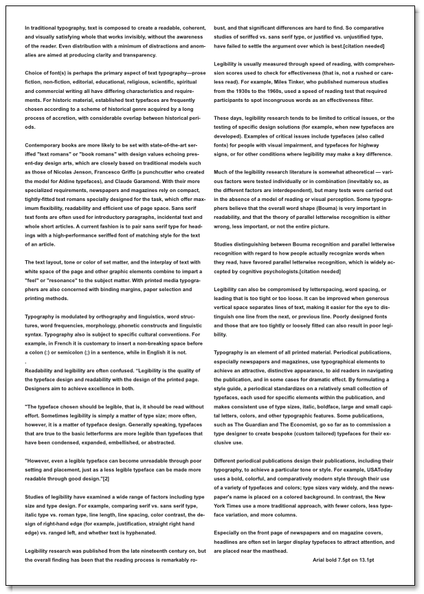
And bold 7.5pt on 13.1 was the most difficult.
The overall most comfortable combination that didn't feel like there was too much text to read was:

Serif 8.5pt on 14.1pt leading with 3 columns.
No comments:
Post a Comment