Sunday, 28 February 2010

Design Practice 2 - Looking at the briefs...

When deciding on what brief to choose out of the 20 competition briefs, I narrowed it down to one I definitely didn't want to do, one that I thought would be suitable for when I do my individual practise and one that I liked for this collaborative brief.

Not for me:
I wanted to produce something in print for this project, so a digital based web design brief is definitely something I can rule out:

HMV

Design ways for customers to quickly and easily find and buy what they want from hmv.com

Introduction

The first HMV shop was opened in 1921 at 363 Oxford Street, in one of London’s most prominent shopping districts. Since then, we’ve developed into one of the world’s leading retailers of music, video and games, with stores across the UK. We focus on providing an authoritative breadth and depth of offer that is, we believe, superior to that of our competitors.

Launched in 1998, hmv.com is now one of the most visited retail sites in the UK. It offers a massive selection of music, video and games as well as digital products like the HMV player – a streaming music service with access to over four million tracks. As the world becomes more digital, HMV is adapting and growing our online services to remain at the forefront of new retailing.

Who We Are

Over the years we’ve changed a lot about how we look and feel to customers. Most recently, we’ve updated and revitalised our brand under the Get Closer banner. New colours, new graphics, new stores and new approaches combined with our new focus – get closer to the music, film and games you love – have positioned HMV in a place we know and love.

The stuff we sell has to be some of the most exciting products on the planet: the music that defines who you are, the movies that change the way you view the world and the games that let your imagination soar. And it’s not just our customers who love it. We’re passionate about it too. Our staff live and breathe music, movies and games and spend a lot of their free time immersed in all three.

Some things don’t change though. We’ve still got Nipper, our beloved mascot. We’ve still got a store on Oxford Street. And, most importantly, we’ve still got to sell great stuff that people want, in the way they want it.

Challenge

Our challenge is a digital one. While keeping within our brand and adhering to the highest standards of usability, design ways for customers to quickly and easily find and buy what they want from hmv.com.

We’d like you to focus on improving user experience within some specific parts of hmv.com - product detail pages for CDs, DVDs and games, search results, and our homepage.

Direct links to these pages, along with a little more context of how we’d like to improve them can be found in the project pack.

Objective

The ultimate objective of everything we do is to offer our customers the best experience we can. Our belief is that the best online experience, combined with great products, leads to profitable sales.

For example, adding ratings and reviews to products improves conversion because customers want peer-generated opinion on the product before purchase.

Mandatories

  • Everything must fit within our existing brand.
  • All processes and designs must meet the highest standards of usability.
  • All designs should be DDA (The Disability Discrimination Act) accessible.
  • Designs should be achievable, practical and affordable.
  • Processes and designs should assume the use of existing digital tools.


Individual:
This is an example, along with a few others I haven't decided on yet, that I could get a lot out of as an individual brief.

H. Samuel

Create a campaign which challenges the perception of H.Samuel as a traditional retailer, and encourages younger customers to re-evaluate us.

Overview

It would be fair to assume that almost every person in the UK would have either bought or received a gift from H.Samuel at some point in their lives. Throughout our 140 year heritage our ideology has been to make jewellery and watches accessible to all; ranging the widest selection of branded watches and a huge range of gold, silver and diamonds as well as branded jewellery, all at affordable prices.

Aim

Create a campaign which challenges the perception of H.Samuel as a traditional retailer, and encourages younger fashion forward jewellery and watch customers outside of seasonal occasions to re-evaluate us.

Being the UK’s number one specialist jewellery retailer, we are immensely proud of the part we play in helping our customers say it better with our gifts from H.Samuel. Our tag line “Helps You Say It Better” is based on the gifting ideology that a gift from H.Samuel is a more thoughtful and considered purchase than your everyday gifts. Basically, whatever you are trying to say, to whomever you are trying to say it...a gift from H.Samuel will help you say it better.

Target Audience

  • 18-30 year olds, both male and female.
  • Purchasing outside of traditional gifting occasions (such as Valentine’s Day and Christmas).
  • Motivated by self purchase, and/or gifting for birthdays and other personal special occasions.

Creative Requirements

To illustrate that H.Samuel is not just a traditional gifting retailer and rouse curiosity in those younger consumers who may not have considered H.Samuel as a retail destination. You should demonstrate how our tag line Helps You Say It Better could be applied, but it is not mandatory that you include it.

Media

You should demonstrate how your creative concept could be applied to three different types of media, one of which must be our in-store environment. Images of past in-store creative can be found in the project pack.

Tone of Voice

Our tone of voice is friendly, approachable, and magical.

Mandatories

Where appropriate you should include the H.Samuel logo within your work. This can be found in the project pack.


Collaborative:
This one is bound to be a popular one but it opens up lots of possibilities for a collaborative brief and I would love to see what I can produce combining mine and my creative partners skills with a theme (music) that I love.

BME

Develop campaign ideas and concepts that communicate the richness of the British Music Experience.

What is the British Music Experience?

The British Music Experience is Britain’s interactive museum of popular music, combining cutting edge audio-visual technology with some of the most coveted music memorabilia of all time.

You can trace historic, era defining moments and trends through 60 years of music history, learn about British music’s influence on art, fashion and politics, feel the thrill of being in the crowd at a legendary gig, flick through virtual record collections, eavesdrop on fantasy dinner parties and search across a giant interactive music locations map of Great Britain.

Not only that, in the Gibson Interactive Studio you can develop your skills on guitar, bass, drums and keyboard. In the Sennheiser vocal booth you can record your own track and you can record your dance video in Dance the Decades.

Hundreds of pieces of British music memorabilia are featured, including David Bowie’s Ashes to Ashes clown suit and Ziggy Stardust costumes, Noel Gallagher’s Union Jack guitar and dresses from Amy Winehouse and Leona Lewis.

There is also a full educational programme with workshops, lectures, master-classes and concerts.

The British Music Experience is a registered charity with the purpose to advance the education and appreciation of the art, history and science of music in Britain.

And finally, when you return home you can log into your ‘MyBME’ library and access all of your performances and favourite parts of the museum and continue your trip through music history.

The Creative Challenge

The challenge here is to develop ideas and concepts that communicate the essence – and the richness - of the British Music Experience.

The brief is being kept deliberately very open and you are free to approach the challenge as you see fit, playing to your strengths.

Media

The media usage could be anything from a press ad in NME, a 6 sheet poster in a tube station or a leaflet handed out at a festival. Elements of the creative may also be brought alive digitally through online or through motion graphics. You can demonstrate your thinking in any of these media but bear in mind that it will have to work across them all.

Target Audience

Your campaign should appeal to anyone and everyone with an interest in music and Britain’s cultural influence – from children of a primary school age to senior citizens; from Spice Girl wannabes to those who saw Beatle-mania first time round! Think about tourists from around the UK and abroad who are visiting London’s landmarks.

Come and experience things for yourself!

Anyone tackling the challenge is invited to visit the British Music Experience for free in order to experience the exhibition in person and help to better inform their interpretation of the brief. Details of how to get hold of tickets can be found in the project pack.

Mandatories

You must use the logo within your work but how this is done is completely up to you - just don’t mess with its shape and colours!

Friday, 26 February 2010

Business cards

In our latest typography session, we were practising designing business cards. To begin with we were given a specific job each. I was given 'House Removal' so had to choose a font that best fit the job. This was my simple design below:


We then had to start thinking seriously about designing our own business card, taking into consideration the layout, colours and typography to give out the right impression of ourselves and be remembered. For example, do we want to look cheap, expensive, arrogant, professional, friendly, formal, informal etc.
These are my initial ideas, playing around with layout and simple shapes and colours:


Here is my chosen design for now showing three different typefaces:


I really enjoyed experimenting with simple layout, colour and type and will continue to develop something that really nails who I am as a designer.

Sunday, 21 February 2010

Type workshop 6

The task was to fit the text given into an A5, 8 page booklet. Here's the result.


I used Baskerville (regular), a serif font at 9pt on 11pt leading, which successfully filled the booklet on a 2 column A5 page.

Sunday, 14 February 2010

Click on the OUGD202 button in the labels list on the right to see all posts for the Digital module.

END OF MODULE SELF-EVALUATION

This module has has been a great achievement for me personally as I had no knowledge whatsoever about After Effects and DVD Studion Pro and now I can confidently use the basics and am not afraid to try new things out. By designing work in preparation for After Effects, I have improved on my Illustrator and Photoshop skills and now show a certain degree of technical competence. In terms of the Movie Season idents, I wanted to keep them quite simple to be able to confidently use the basic techniques on the software, produce moving images and not over complicate myself by taking on an impossible challenge. I was pleased with the outcome, and was always fascinated when learning even the smallest of things within the software workshops as I have always wondered how it was done.

Developing storyboards and being able to jot down on timelines how you imagine your frames to work in terms of pacing was a skill that, again like the software, I had no background knowledge of and now have learned a lot about the importance of hand drawn designs and putting your thoughts down on paper before making the ideas digital.

My time management has definitely improved mainly due to asking for help and advice when needed, cutting down on time spent worrying, and coming across difficulties using the software.
The main reason for this were the software workshops which were always a major help to me and I am pleased that I noted down all that I learned from each session as it meant I was more independent than I thought I would be when moving from storyboarding to the screen. I also tried a lot harder than in the last module to keep my blog updated, allocating time slots through the week to do it and making sure any digital work that would be needed in the final DVD were always organised into one file, again cutting down the worrying process towards the deadline that I hadn't included all that I needed to. I live my life around 'to do lists' so it helped to always be writing daily or weekly plans to keep on top of eveything. It felt like a very long, hard module at times, but if I stuck to my plans, I was fairly happy week on week at seeing my efforts of organisation pay off.

My researching skills began successfully, as I generated a questionnaire and targeted it towards my audience, I bought and watched many films within my chosen genre and found inspiration for colours, typefaces, etc from their promotional posters, title sequences and dvd interfaces. However I am aware that I could have worked harder to creating my idents based on more of a 'style' of design as by just doing simple vector based graphics, it left me struggling for putting up other designers work on my blog that I could take inspiration from. This was also commented on in one of my crits, but balanced out by the fact that I 'had looked in detail at the chosen films and analysed my decision process well.'

I also think I could have worked more with the storyboards and perhaps come up with more initial ideas to have a wider range of them to choose from and it would have helped develop my skills even stronger and meant I had much more development work to work from. My reason behind this however, was that the five ideas for idents I did come up with immediately seemed to fit the theme and I was confident to re-create them on screen so I stuck with them and moved on, not wanting to fall behind on my weekly action plans. When going onto the next module however, I do want to spend more time working on generating ideas and building a stronger concept as I know that was something that lost me marks in the previous print module.

Five things that I will do differently next time:
- Work more with initial design decisions and concepts to have a stronger overall project to work with.
- Stop writing things down - visualise them and draw them!
- Allow more time for research and continue to do so until the very end of the brief.
- Use the library more and research broader. I love books more than the Internet so why aren't I doing so?!
- Don't be afraid to ask for advice outside of crit times.


Grading myself on the following areas:

(5= excellent, 4 = very good, 3 = good, 2 = average, 1 = poor)

Attendance 4
Punctuality 4
Motivation 4
Commitment 4
Quantity of work produced 3
Quality of work produced 3
Contribution to the group 3

Friday, 12 February 2010

Type workshop 5

This week's session involved a lot of concentration! These texts below are probably not very clear for such small detail changes, but we had to play around with columns, gutters and margin widths to begin with, finding the ones that sit right on a page. It then got more complicated as we altered the leading on page after page of text and discussed and compared which point size and leading sat comfortably on a page together and whether serif or sans serif fonts affected it.

Columns:

More white space from a margin doesn't always mean an easier read. Here I widened the margin and squashed all the text together by choosing 3mm indents instead of a line break between paragraphs. However this proved to be unsuccessful and made it even more difficult to read. The line breaks in the second piece give it a more relaxed feel even though it now takes up more room on a page.


The 2 column pages also have the same problem. Yes there's more space on the first piece but again it is like looking at two overpowering blocks of text, due to the justified paragraphs, making it more uninviting to read.


Successful & unsuccessful leading:


Serif font, 7.5pt on 14.5 leading, even though small, had a good amount of space between the lines to make it a comfortable read.


Bold serif, 9pt on 12.1 leading was too black, overpowering and crammed together.


Sans serif was the opposite; 9pt on 11.9 leading was easiest to read...


And bold 7.5pt on 13.1 was the most difficult.


The overall most comfortable combination that didn't feel like there was too much text to read was:

Serif 8.5pt on 14.1pt leading with 3 columns.

Thursday, 11 February 2010

DVD: Done


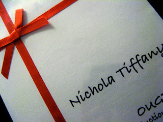
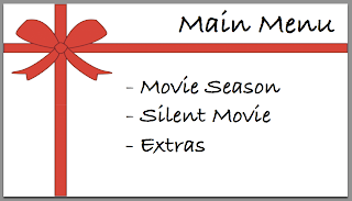
The packaging was something that I wanted to keep simple to finish off the dvd and keep it fitting with the theme of my movie season Rom-Com designs. The simple red, white and black colours, the typeface and the ribbon also matches the dvd menu designs. It felt strange to be just handing in this one disc, instead of struggling on the train with my big heavy folder, but I was pleased with the package and very relieved to hand it in on time all the same!

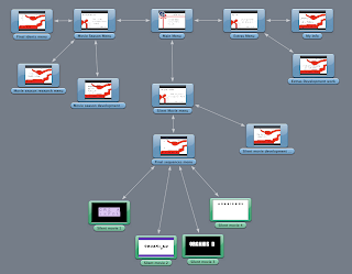
Final DVD Schematic


Wow! This looks busy! But I am pleased that I allowed myself enough time to include all that was necessary and all that I wanted to within my DVD and that I had organised all my work so as to not stumble across any last minute errors or panick moments. Success!

Original Rationale

Brief Title: Romantic Comedy Movie Season Idents for Film Four

Subject & Rationale (including themes, target audience, tone of voice)
- Promoting Romantic Comedies of the past decade (2000-2010) within a set of 5 idents.
- To be shown on Film Four the week leading upto Valentine's Day.
- Seven films will be shown, representing 'Every Night, all this week A mixture of films will be promoted within each ident giving a taster of 7 films that will be shown; one per night.
- Women between 18-34 will be my target audience, who enjoy feel good Rom Coms and are regular cinema goers, or like to catch the latest films shown on an evening on Film Four.
- The tone of voice will be soft, simple, romantic and happy fitting typically with the films theme.
- Each ident will take on a slightly different romantic theme, but all will have aspects that stay the same throughout tying them all together, e.g. the music clip, the colours and Film Four logo.

Design Directions:
- Each ident is a combination of kinetic typography and still image clips from the films.
- The type wants to be quirky and feminine but not too swirly and complicated to mistake it for an old fashioned handwriting. Inspiration to be taken from title sequences of the films I am promoting.
- Colours will depend on the films. The titles used in the idents will match the colours used in their promotional material, such as posters and trailers, etc. However, Film Four typically has a red and white logo and usually ends its adverts on a red background so that will be the basis to use to begin with.
-The music that will be played in the background of all 5 idents will be solely instrumental so as not to be too distracting, such as the Portuguese Love Theme from the soundtrack of Love Actually.

Wednesday, 10 February 2010

Timelines

These timelines for my idents may look a little crazy and overcrowded to some of you, but I was really pleased with the overall look and with how I calculated, based on rough sketches of pacing, the exact time there was a change within the frame and I decided to lay it out based on the style we had created when in the group session towards the beginning of the module.

[Click here] for that blog post to see where my inspiration came from.

I used screen grabs from my development designs on Illustrator to lay out my final storyboards in a more complex but realistic way to demonstrate the action and events that happen with each one.


Final Ident Storyboards

I love these storyboards and actually think they portray my idents in a much more exciting and interesting way than the actual idents themselves!! I have tried to demonstrate each frame of movement when something important happens, a neater and updated version of my original sketches with annotations [see here].

Ident 1


Ident 2


Ident 3


Ident 4


Ident 5

Sunday, 7 February 2010

Final 5 idents...

Overall I am pretty pleased with my final idents. They may not be as complex or stand out as much as others I have seen (many people have achieved this brief at an amazing standard and I could definitely imagine their idents being played on the TV) but I am satisfied with myself for understanding and remembering the knowledge, tips, shortcuts within software, basic technical skills etc. that I have picked up throughout this module. Never in a million years did I think I was capable of getting my head round and designing for motion graphics but I thoroughly enjoyed it...despite the late nights in the mac suites towards the end!

I particularly like the ribbon movement that I managed to achieve in the second of my idents, based on learning bit by bit from my notes taken in the software workshops. This is by far the most difficult thing that I designed within them and took the most time to set out the path for it to move along, having to alter the shape of it everytime the angle changed. I made use of the different camera angles and the 3D tools within the software for all idents as well as experimenting with adding keyframes and transforming using rotation, scale, position etc. My strongest for technical competence would have to be ident 2, but my favourite that I think links in with the Rom Com theme and would probably look the most realistic as an ident would be ident 1. The still images from the films don't look as motionless as they are springing towards you out of the box. It's a simple idea but I took my inspiration from Love Actually's opening DVD menu and it was the first one I completed so left me very excited about what was actually possible with the software.

1.


2.


3.


4.


5.

Saturday, 6 February 2010

Another Tester


Experimenting using the back and foreground of the frame by using the rotation tool and scale alteration to make it look as if it is spinning towards us. Next comes the 3D tool, where I have to use a combination of rotating the X, Y and Z coordinates to make it look like the card is opening...this is where my head explodes from deep concentration and too much mathematics!

Thursday, 4 February 2010

Type workshop 4

Putting all our skills learned so far together to design a magazine layout using given text and image. Hierarchy, white space, column numbers and widths, typeface, point size and paragraphs all came into consideration:


In this session we also had to design a leaflet with text and images already provided. It was a leaflet giving information on the Allotments Regeneration Initiative and we had to suitably arrange the layout and think about the typeface, font size, leading, column arrangement etc.

Here was my first attempt:


I then went away and spent a bit more time on it and here is what I came up with.

Pg 1


Pg 2&3


Pg 4&5


Pg6

Wednesday, 3 February 2010

Final Crit

I know I have already posted these to my blog but I have put into this one blog post most of
what I have been working on since the last feedback session to make it easier to present in this final crit.

Storyboards

1.


2.


3


4.


5.


Testers:
Experimenting with basic 3D layers and rotation to create the opening frames of my first ident:


2nd tester: Adding the 10 second music clip I want to use, taken from Love Actually's soundtrack titled Portuguese Love Theme. The gentle build up and soft notes are exactly what I was wanting to run behind all 5 idents to link them together. There's no movement after 2 seconds, but I was experimenting matching the opening frames with the timing of the music ...


1st Final
First of my five 10 second idents completed:


2nd Ident tester
(Ribbons will appear like the text floating from frame to frame linking one film to the next - see storyboards)


DVD Designs:


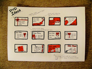
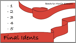
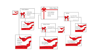
Here are the final designs for my dvd. There are 3 designs; the first being the main menu, the second is an internal menu linking from that and the third is the next step to reach my videos/development work etc.


Original schematic layout but with these 3 chosen designs (I know its small but you get the idea of how the designs fit in). Next step... put them all together in DVD Studio Pro.


Experimenting putting my designs above onto DVD Studio Pro:


1 Week Plan:
- Learn how to make the ribbons in ident2 follow a path so it flows like the text does.
- Complete other 3 idents
- Put all my work together onto DVD Studio Pro

Questions:

1. Does the combination of designs work well in the dvd interface, or would it look better to just have the same menu background throughout?

2. The typeface used in all idents and in the dvd designs was chosen from the Sex and the City opening title sequence (suggested in my previous crit). Do you think it looks relevant to the Romantic Comedy theme as a whole?

3. Is the ten second music clip in my first ident appropriate or does it need lyrics?

4. Should I alter the film four logo more evidently to fit in with the rom-com season? (such as use the ribbons on ident 2 to flow into the logo shape perhaps...)

5. Is the first completed ident too rushed? Have I included too much into the 10 seconds? If so, how could I simplify it?


*Reasons for typefaces and colours chosen can be found on these two blog posts:

Type
Colour

***End of Presentation***