*Colours are just testers for now
Sunday, 31 October 2010
Friday, 29 October 2010
Stationery so far
Here is the overall look chosen for the make up identity brief that I prefer. It's not Gemma's favourite font, and she wants a bright pattern or something to make it less pastel and soft looking. I have continued to work on this, but as a portfolio example, I definitely want to use this idea, as I get to show the simple, clean design that I like to do, rather than the client driven design that moves away slightly from this.
Appointment card
As part of the stationery designs, I wanted to include an appointment card for Gemma to be able to give to clients when they book. This is just an initial idea to work with the business card design at this stage, showing front and back design:
Potential business cards
Waiting to hear back from Gemma about what she thinks to my ideas at the minute, but I carried on with the design that I think was the strongest, adapted it slightly to give a more complete look...
...And designed some quick business card ideas:
...And designed some quick business card ideas:
Thursday, 28 October 2010
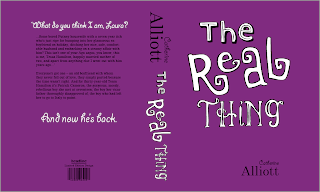
Full cover
Here's my first resolved full book cover design. It's taken a while to set up the measurements, grids and layout but I have printed a mock up and it fits around an original Catherine Alliott book so I am pleased with it. Hopefully now I can work with the same layout to produce the other 10 books a bit quicker. There is no doubt going to be something that's a millimeter or so out, but when I've produced them all, I will do lots more testers.
*The colour is still just a tester.
*The colour is still just a tester.
Tuesday, 26 October 2010
Which One?
Colour decision made at this stage, but with which typeface combination?
Comments would be greatly appreciated :)
Colour experiments
Obviously when designing for a make up artist, any colour could be used to represent them, as it's a very colourful job. However, after chatting to Gemma about preferences, she wanted to go with anything bright and not too 'girly'. This rules out some designs I'd already done, but the violet tones I have experimented with could work, as could the multi-coloured design below.
However, because this is just a proposal for Gemma and her budget (if she chose my designs) would be small as she is just starting out, I think a one colour design such as the last idea above would be appropriate. Now I just need to decide on a typeface to use. I like the example above, I'm just not sure it makes me think 'make up artist' as strong as some other ideas...
Saturday, 23 October 2010
Action Plan - Brief 4
By the next crit I want to have:
- Exhausted make up artist identity ideas - focusing more on colour and type than obvious imagery previously used.
- Finalised an identity design
- Applied it to stationery designs
- Received feedback from client
Action Plan - Brief 3
Before the next crit I want to have:
- Researched into print processes that could be used for the menu designs - found examples.
- Come to a more clear decision about suitable fonts and layouts based on existing design inspiration.
- Simplified colour choices - needs to be minimal and subtle - unlike initial ideas so far.
Action Plan - Brief 2
After a few weeks focusing more on two of my other briefs, before the next crit I want to have:
- Visited the Yorkshire Wildlife Park again for further research and better animal and signage photography
- Began initial ideas - visuals
- Started typography designs
Action Plan - Brief 1
Before the next crit I want to have:
- Designed the full book cover jacket.
- Worked with one cover to get the colour design and layout right so that it's hitting the full target audience range (at the minute it looks too young) then match all covers to chosen design.
- Experimented further with colour and printed off a variation of mock ups to work with true printed colours.
- Researched into promoting the covers - online, bookstores, posters, etc.
Friday, 22 October 2010
Monday, 18 October 2010
Subscribe to:
Comments (Atom)


