Sunday, 5 December 2010

Posters for boards

I think this typeface definitely works better than the zebra type and my other ideas and I really like it on the signs around the park. If I had managed to design the printed materials, this brief would have more depth and portfolio pieces. I plan to work on this typeface and not let this brief go to waste by printing the full typeface range large scale, perhaps screen printed to give it a more hand crafted, natural look to match the theme of the type.


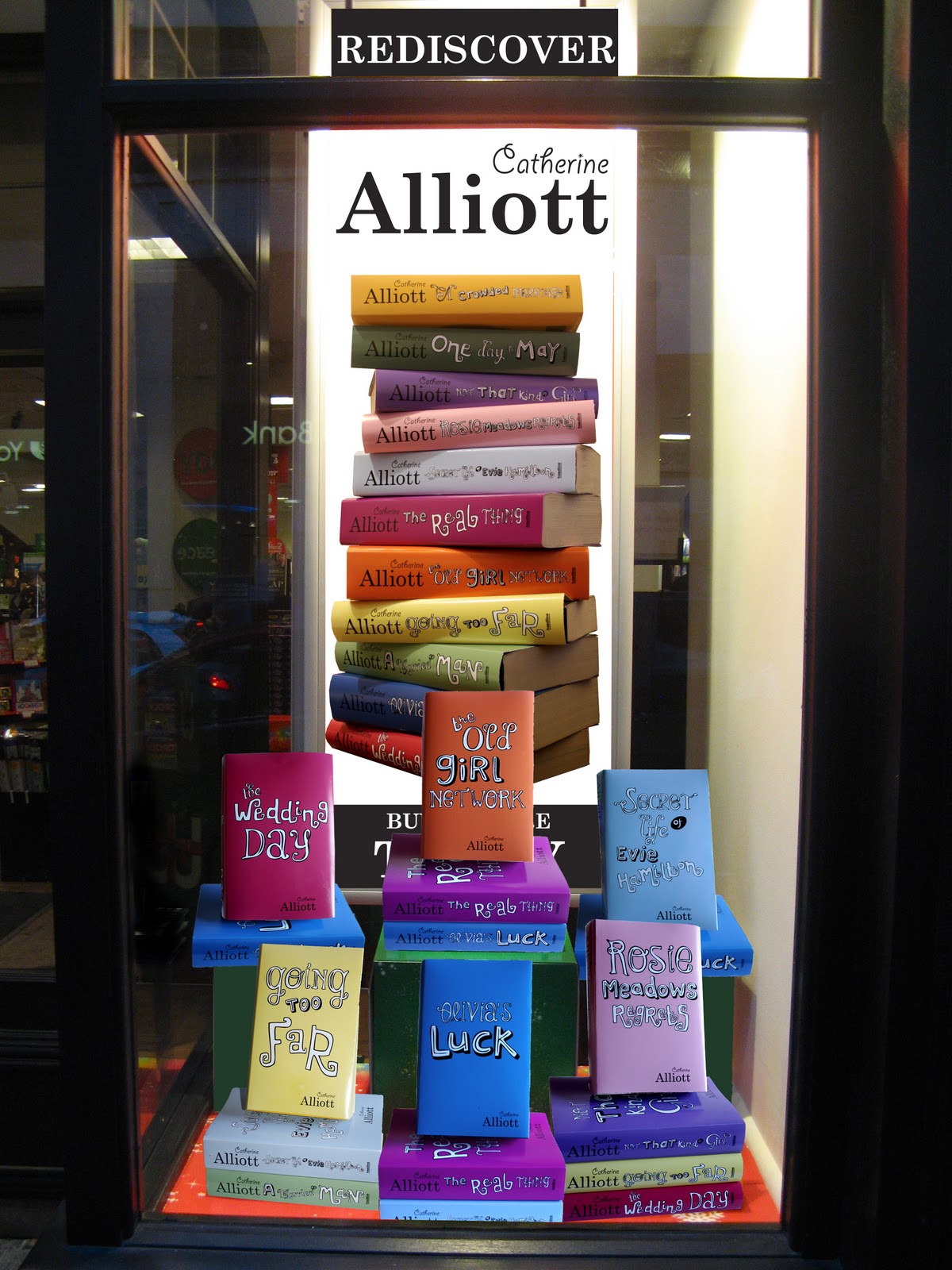
Main window display

Final park signs


Saturday, 4 December 2010

Bookstore context


Twig type in context


Ideally I wanted to design my own leaflet and guides to be able to apply the typeface to, but due to lack of time now, I am just proposing what it looks realistically within the existing park materials. I don't think it shows it off well enough as I would have liked it against a lighter background and with more space to enlarge the typeface to see the hand drawn twig detail. This context doesn't do it as much justice as I imagined.