Looking back over my original rationale there are areas that I have worked on and put into practice, as well as some aspects that I didn't cover. This is a good and bad thing as it means I can take this module and learn from it when going into my final major project module.
I wanted my main focus to be on typography and to produce work that involves layout designs working both digitally and with hand crafted processes. My strongest brief that covers all aspects of my rationale is the Catherine Alliott book cover brief. I learned a lot more about Illustrator when I was working with the hand drawn designs and really enjoyed the start of the brief where I just filled a whole sketchbook with hand drawn typography ideas and experimented with different medias. Putting those type designs into the context of a book cover was also a learning curve as I was working with a complicated grid that took quite a lot of time to get right. I also improved on my Photoshop skills when practising putting the designs in the context of a bookstore. I was really pleased with the outcome of this brief, but because I enjoyed the development stage so much, it meant I spent too long focusing on this brief and had put the other briefs to the back of my mind. I thought this wasn't going to be a problem and put action plans in place to get me back on track, but I feel like my other briefs never got the chance to really catch up to the level this first brief is on.
This time management issue meant that I was always playing catch up with my other briefs as well as my expectations so I am not as pleased with some of the briefs that I was initially really excited to start. An example of this is the Type Goes Wild brief. Again it was an opportunity to get involved with hand drawn typography with quite a broad nature theme that I thought was going to open up to be a strong brief. However, it involved a bit of research time at the start and after working on some development ideas, I struggled to really get into it. I like my chosen typography design at the end, but ideally I wanted to produce my own map, leaflet and printed guide that I could add the typeface to, instead of applying it to the existing wildlife park materials. This could then have helped me produce more designs that show my type layout skills on publications and printed media.
The Make up Artist brief, however, stretched out longer than I had anticipated but this was due to it being a client driven brief and the client was quite busy and in no immediate hurry for proposal ideas, so didn't always get back to me when I hoped. This was something I can learn from in the future, that with live briefs, you have to allow for set backs. In the end it was a simple identity brief but I expanded it out to propose more of a range of products and options that the client was really pleased with. I got to experiment with stationery design and learned a lot in the process.
On the other hand, my live placement brief was a lot shorter and it showed me what I can do in a day, even with tight guidelines from the client. It meant I didn't produce an amazing piece of design for my portfolio, but I got to work with what was given to me by the client and simply experiment with layout. This was a really enjoyable 2 days and I can take a lot from this in terms of timescales.
The menu brief ('Anyone for Dessert?') was one that allowed me to work with layout of quite a text heavy inside spread, but also encouraged me to try a print process like foiling that I have never used before. However I would have liked to have practiced on more of a range of stocks and processes to see what other options the menu covers could have had and to help me develop more skills and understanding of print.
Going into my final module I want to ensure I stick closer to my rationale and work at creating design layouts for publications, for example, design hand drawn typography and produce more quality printed outcomes to really show what I enjoy.
Showing posts with label Brief 4 - Make up Artist (Live brief). Show all posts
Showing posts with label Brief 4 - Make up Artist (Live brief). Show all posts
Wednesday, 15 December 2010

Saturday, 11 December 2010


Wednesday, 1 December 2010


Monday, 29 November 2010
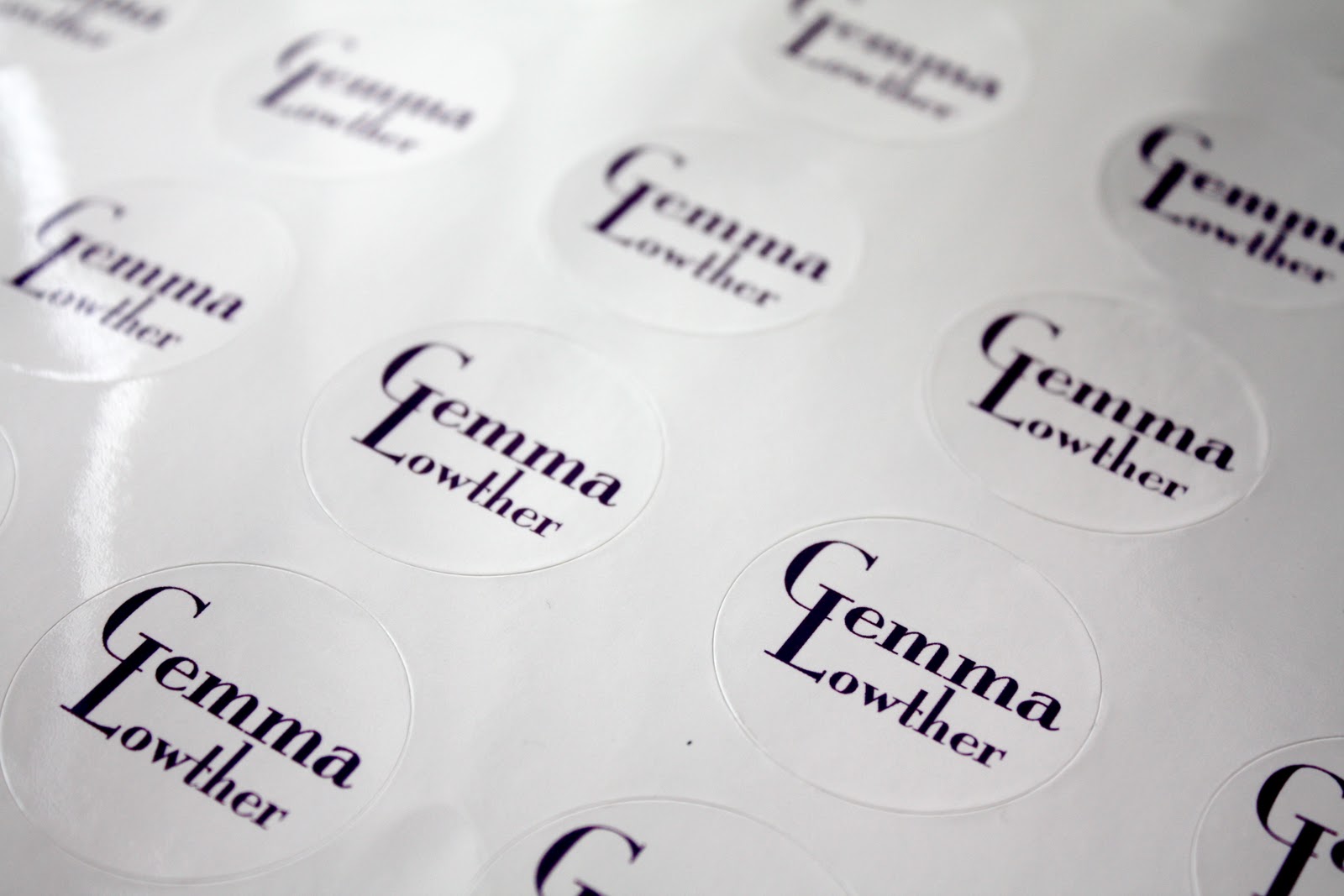
Stickers
I designed logo stickers to be applied to make up products, and I think the lettering works really well for an identity label:



Saturday, 27 November 2010
Less than 3 weeks to go!
Here is my Still to do list. I think it is manageable as long as I stick to it.
 Here's how I have timetabled it, as realistically as possible:


Thursday, 18 November 2010
Final identity
After proposing both designs to the client, my original idea was actually chosen over the one they liked before. Here are the stationery designs and to expand the brief I want to apply the logo to products the client uses to propose how their own make up label could look.


Friday, 12 November 2010


Wednesday, 3 November 2010
Client's Chosen Identity
After feedback from Gemma, I designed her identity using the font and colour she preferred. As this is a client driven brief, I tried to add everything she wanted, which also included a bright pattern to really show her vibrant, loud personality and style. I want to continue to work on the design for her website as this was just an initial mock up, but in total I have designed her logo and stationery, which includes:
**Business card
**Letterhead
**Compliment slip
**Appointment card
**Launch party invitation
**Proposal design for web

**Business card
**Letterhead
**Compliment slip
**Appointment card
**Launch party invitation
**Proposal design for web

Friday, 29 October 2010
Stationery so far
Here is the overall look chosen for the make up identity brief that I prefer. It's not Gemma's favourite font, and she wants a bright pattern or something to make it less pastel and soft looking. I have continued to work on this, but as a portfolio example, I definitely want to use this idea, as I get to show the simple, clean design that I like to do, rather than the client driven design that moves away slightly from this.


Appointment card
As part of the stationery designs, I wanted to include an appointment card for Gemma to be able to give to clients when they book. This is just an initial idea to work with the business card design at this stage, showing front and back design:


Potential business cards
Waiting to hear back from Gemma about what she thinks to my ideas at the minute, but I carried on with the design that I think was the strongest, adapted it slightly to give a more complete look...


...And designed some quick business card ideas:


...And designed some quick business card ideas:


Tuesday, 26 October 2010
Which One?


Colour decision made at this stage, but with which typeface combination?
Comments would be greatly appreciated :)
Colour experiments


Obviously when designing for a make up artist, any colour could be used to represent them, as it's a very colourful job. However, after chatting to Gemma about preferences, she wanted to go with anything bright and not too 'girly'. This rules out some designs I'd already done, but the violet tones I have experimented with could work, as could the multi-coloured design below.


However, because this is just a proposal for Gemma and her budget (if she chose my designs) would be small as she is just starting out, I think a one colour design such as the last idea above would be appropriate. Now I just need to decide on a typeface to use. I like the example above, I'm just not sure it makes me think 'make up artist' as strong as some other ideas...


Subscribe to:
Posts (Atom)