Looking back over my original rationale there are areas that I have worked on and put into practice, as well as some aspects that I didn't cover. This is a good and bad thing as it means I can take this module and learn from it when going into my final major project module.
I wanted my main focus to be on typography and to produce work that involves layout designs working both digitally and with hand crafted processes. My strongest brief that covers all aspects of my rationale is the Catherine Alliott book cover brief. I learned a lot more about Illustrator when I was working with the hand drawn designs and really enjoyed the start of the brief where I just filled a whole sketchbook with hand drawn typography ideas and experimented with different medias. Putting those type designs into the context of a book cover was also a learning curve as I was working with a complicated grid that took quite a lot of time to get right. I also improved on my Photoshop skills when practising putting the designs in the context of a bookstore. I was really pleased with the outcome of this brief, but because I enjoyed the development stage so much, it meant I spent too long focusing on this brief and had put the other briefs to the back of my mind. I thought this wasn't going to be a problem and put action plans in place to get me back on track, but I feel like my other briefs never got the chance to really catch up to the level this first brief is on.
This time management issue meant that I was always playing catch up with my other briefs as well as my expectations so I am not as pleased with some of the briefs that I was initially really excited to start. An example of this is the Type Goes Wild brief. Again it was an opportunity to get involved with hand drawn typography with quite a broad nature theme that I thought was going to open up to be a strong brief. However, it involved a bit of research time at the start and after working on some development ideas, I struggled to really get into it. I like my chosen typography design at the end, but ideally I wanted to produce my own map, leaflet and printed guide that I could add the typeface to, instead of applying it to the existing wildlife park materials. This could then have helped me produce more designs that show my type layout skills on publications and printed media.
The Make up Artist brief, however, stretched out longer than I had anticipated but this was due to it being a client driven brief and the client was quite busy and in no immediate hurry for proposal ideas, so didn't always get back to me when I hoped. This was something I can learn from in the future, that with live briefs, you have to allow for set backs. In the end it was a simple identity brief but I expanded it out to propose more of a range of products and options that the client was really pleased with. I got to experiment with stationery design and learned a lot in the process.
On the other hand, my live placement brief was a lot shorter and it showed me what I can do in a day, even with tight guidelines from the client. It meant I didn't produce an amazing piece of design for my portfolio, but I got to work with what was given to me by the client and simply experiment with layout. This was a really enjoyable 2 days and I can take a lot from this in terms of timescales.
The menu brief ('Anyone for Dessert?') was one that allowed me to work with layout of quite a text heavy inside spread, but also encouraged me to try a print process like foiling that I have never used before. However I would have liked to have practiced on more of a range of stocks and processes to see what other options the menu covers could have had and to help me develop more skills and understanding of print.
Going into my final module I want to ensure I stick closer to my rationale and work at creating design layouts for publications, for example, design hand drawn typography and produce more quality printed outcomes to really show what I enjoy.
Showing posts with label Brief 1 - Catherine Alliott. Show all posts
Showing posts with label Brief 1 - Catherine Alliott. Show all posts
Wednesday, 15 December 2010

Saturday, 11 December 2010


Monday, 6 December 2010


Sunday, 5 December 2010
Saturday, 4 December 2010


Thursday, 2 December 2010


Saturday, 27 November 2010
Less than 3 weeks to go!
Here is my Still to do list. I think it is manageable as long as I stick to it.
 Here's how I have timetabled it, as realistically as possible:


Monday, 15 November 2010
Web promotion
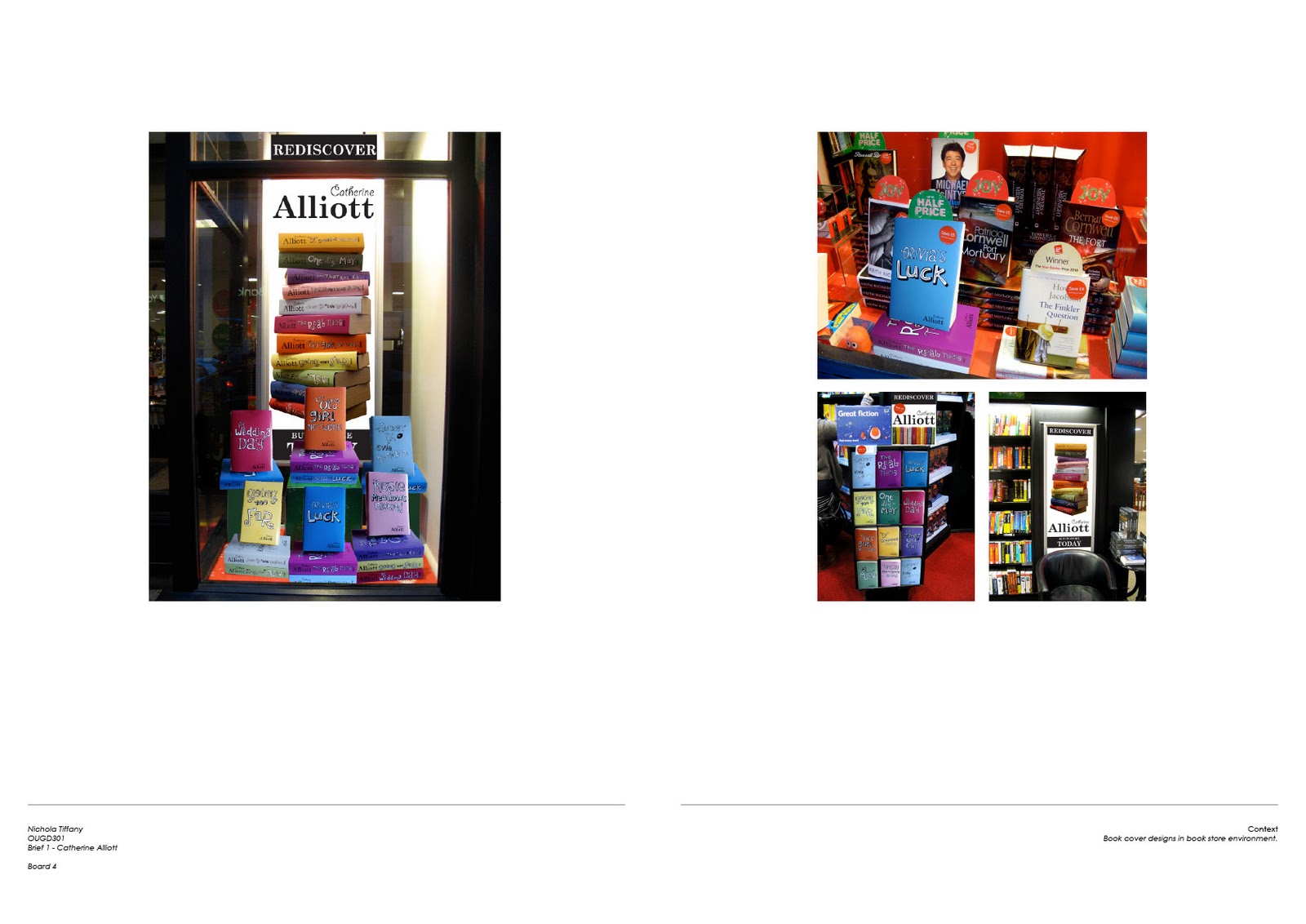
After my crit it was decided that I definitely should use my poster designs in other places as well as in book stores and window displays. Originally I wanted to advertise the books online so I used the Waterstones website as the basis for my promotion:


Sunday, 14 November 2010

Friday, 12 November 2010


Wednesday, 10 November 2010
Promotional posters
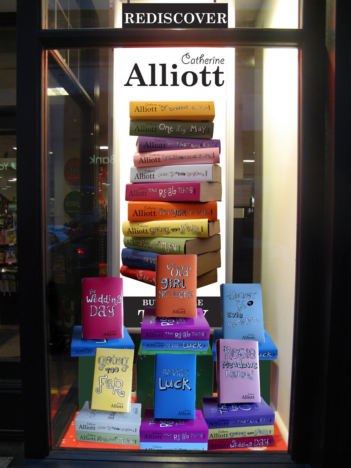
Here are some ideas for instore promotion. These designs can be applied to various scale posters in window displays or anywhere within bookstores like Waterstones, WHSmith, etc. The books are colourful enough, so I used a black and white look for the type to keep it simple. As well as poster designs I also want to design for other contexts, such as online adverts on Waterstones website. Hopefully the next crit will also give me more ideas of how I could promote the book covers.


Tuesday, 9 November 2010
Printed resolutions
I decided to choose a gloss finish for the covers to make them stand out more against all the other books within the chick lit genre. Often pastel colours and white are used on a matt or satin stock that don't stand out and all blend into one, so I decided to try something different and use a bolder choice of colours to really mix it up.


Friday, 5 November 2010
Final grid
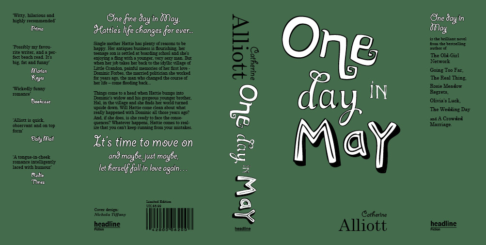
After laying the book cover designs out and seeing them printed, there were many little mistakes on that needed to be corrected. I wasn't happy with the grid I'd used before to line everything up with, so I started again, this time a lot more accurately.

Here are my final layouts, now with more details on back cover and inside flaps. Going to test out stocks that would be best suited to the design next.




Here are my final layouts, now with more details on back cover and inside flaps. Going to test out stocks that would be best suited to the design next.


Sunday, 31 October 2010


Subscribe to:
Posts (Atom)