I want to spend a bit of time away from the mac for this one. The book cover brief is all about handmade type so I began playing around with inks and water colour based on some of the type I found on my context blog.
Sunday, 3 October 2010
Saturday, 2 October 2010
Anyone for Dessert?
![]() |
| The hotel brand |
This brief involves menu design for a small hotel chain of 7 hotels.
- Aztec Hotel & Spa - Bristol
- Cottons Hotel & Spa - Knutsford
- Kettering Park Hotel & Spa - Kettering
- North Lakes Hotel & Spa - Penrith
- Solent Hotel & Spa - Fareham
- The Millstone Hotel - Blackburn
- Thorpe Park Hotel & Spa - Leeds
Initial research shows that each hotel has a set of different menus, such as breakfast, lunch, snacks, a la carte, supper, dessert etc, so a range of designs will be created for each hotel.
Designing for this is going to be very text heavy and time consuming so I am going to aim to choose 3 menus for each of the 7 hotels to design for and spend a lot of time initially working on copying all the text across and researching into layouts that will inspire this brief. It might be the boring bit, but I need all the information before I can start deciding on fonts, layouts, colour etc. and putting it all together.
Wednesday, 29 September 2010
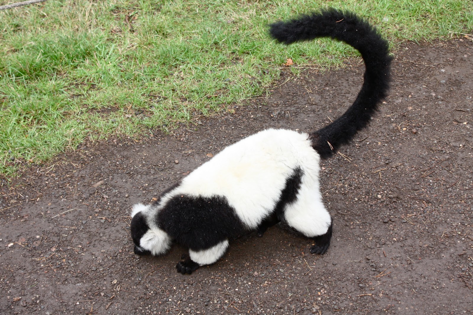
Animal photographs
There are many more, but these photos are going to help me if I choose to add animals to my typeface designs. I want to simply outline the animal and add it to the lettering somehow. Sketches to come.
Monday, 27 September 2010
Existing signs
These two signs below are a good example of how they are using type and image on their signs but I want to combine the two and create a typeface with an animal theme. Using silhouettes like they already do is a good way of not letting the detail of the image take over the type.
As well as applying my chosen typeface to the signs, I also want to re-design the map and apply it to that too. I do like the signs as they are now, and they all have a running theme through them, but I think it's a place that has the opportunity for me to use my illustrative type designs over a range of materials and scales to give my designs a purpose.
Type Goes Wild
The second brief I'm going to be working on involves designing a typeface that can be used across signs, promotional and other printed materials for the Yorkshire Wildlife Park. Here is the current look for the park's promotion:
Subscribe to:
Posts (Atom)